Line of Beauty // How AMMO is redefining the look of Brussels beer
“It’s not about what’s on the bottle, it’s about what’s in the bottle.” It’s a mantra of many traditional Belgian brewers. Anyone who’s worked in the industry will have heard it uttered at least once. But as a long-held orthodoxy of a belgian beer world proud of its shunning of conventional marketing, it’s one that increasingly doesn’t match the actions of the country’s newer breweries. The people that have opened these breweries in the past decade do care about what’s on the bottle. Maybe not as much as what’s inside, but enough to invest in new and creative designs that are slowly moving Belgian beer away from the old ecclesiastic-pastoral vernacular that dominated Belgian beer branding in the 20th century, and into interesting and previously-unexplored artistic directions.
Illustrator Amaury Dastarac is one of the representatives of this new movement, with several of Belgium’s most-respected breweries calling on this blow-in from French Gascony to rejuvenate stagnant identities with his intricate, dense, and gothic fantasia-inspired line drawings. A decade after arriving in the city almost by accident, Dastarac - better known professionally as AMMO - is set for a new challenge: designing, from the ground up the visual identity of Brussels’ newest brewery for an old friend, someone who knows that what’s on the bottle can mean just as much as what’s in it.
AMMO was not long in Brussels when he first heard the “it’s not about the bottle” speech. It was in the late 2000s (or early 2010s, he can’t quite remember), and AMMO was a regular at Brasserie Verschueren in St Gillis. A friend of his, who also happened to be a graphic designer worked at the bar, and one afternoon AMMO and his friend happened to drop into conversation with the son of Nino Bacelle. Bacelle is co-founder of Brouwerij De Ranke, whose XX Bitter and Guldenberg Tripels AMMO had discovered an appreciation for during his visits to the bar. AMMO’s friend rhapsodised about the beers while complaining that De Ranke’s labels were too fussy, hustling for business as much as making conversation. I know, replied Bacelle’s son, but you have to understand something about brewers like him: “What was important was what was inside the bottle.” Through perseverance, this chance conversation morphed into a more serious discussion about a brand redesign for De Ranke, but after some positive back and forth both AMMO and Bacelle say they failed to agree on a way forward. In any case, AMMO was busy trying to survive as a jobbing illustrator in Brussels.
From Gascony to St Gills
He always wanted to be an artist. AMMO grew up in southwestern France, with parents and siblings who constantly encouraged him to draw. After an abortive year at art school in Angouleme, AMMO landed in Bordeaux and it was in that city’s music where he first found release for his creative expression. Inspired by the silk screen poster artwork he came across of his favourite metal and punk bands, AMMO began working with a local music venue, designing posters for concerts of obscure punk and hardcore bands, while in parallel he worked on biographical comic novels of musical figures - Jimi Hendrix, Nirvana, The Clash.
It was creatively fulfilling work, but not financially lucrative. In France there was not much of a market for ornately drawn silkscreen band posters. Despite comic books being reified in French culture as “le neuvième art”, it was, like all publishing, a difficult business for artists to make money from. “Either you start to be famous and bankable, or not at all and it’s really hard,” AMMO says. For AMMO, it was the latter. His intricate, time-intensive style and the vagaries of the business meant the money he was being offered neither matched the time put in, nor was it able to cover his living expenses. The life of a comics illustrator seeming an increasingly distant prospect, in 2009 AMMO and his then-girlfriend (now-wife) took themselves off on a trip to visit friends in Brussels. “We fell in love with this city,” he says. “I like drinking, and I like beers, and I like to party. So here it was like heaven.” So they moved. It helped that Brussels’ location at the crossroads of touring routes for bands performing in England, The Netherlands and Germany meant more poster work for him as many of his favourite bands played at the city’s venues. It was at one of these dark, grungy music halls that AMMO made the early connections with the city’s beer community that would come to define his relationship with Brussels.
Headbangers and Heavy Metal
Sandwiched between a construction site and the beige colossus of a cement factory, Avenue du Port 51B on Brussel’s canal banks is an unobtrusive building. What sets this low-slung concrete bunker apart from the industrial buildings around it is the word ‘Wizard’ sprayed on the building’s facade in bright, big, serpentine, poodle-rock style graffiti. This is the home of Magasin 4, an alternative music venue that hosts hard and heavy metal bands. But this converted shed is also an important location for the embryonic years of Brussels’ beer renaissance. From this substrate of rockers, metalheads, and generally grungy alternative types that hung out here as concert-goers and volunteers emerged a subculture who shared a love for beer. They cared about how beer was made, as much as how it tasted, and they cared who was making it. They valued honesty, favouring an assertive approach to business which focused on the local to the exclusion of the global, allied to an allergic attitude to big business that almost verged on anti-capitalism. Antoine Pierson, founder of bottleshop Malt Attacks. Joel Galy, brewer at Brasserie de la Senne. Maxime Dumay, founder of Brasserie No Science. They - and others - were all there at Magasin 4 when AMMO arrived on the scene.
Working by day as a drawing teacher at one of Brussels’ European schools, AMMO began designing posters for Magasin 4 on a volunteer basis, while deepening his admittedly shallow knowledge of Belgian beer. “I’ll be really frank. I’m French, and I didn’t know how to drink Belgian beers,” he says. His tastes in those early days leaned towards strength and quantity, spending nights out drinking Chimay Bleue from the bottle. “It was a really bad idea. I had to learn how to drink the beers, how to appreciate them, and to be reasonable.” Much of his education happened near his home in St Gillis, at the Moeder Lambic beer café. One of the barmen there was Maxime Dumay, who AMMO had met at Magasin 4, and the pair would sit and drink and chat about Dumay’s gestating brewery project, No Science.
For his brewery’s visual identity Dumay employed his preferred heavy metal aesthetic. While he already had a brewery logo, he’d seen AMMO’s work for Magasin 4 and wanted him to design an upcoming beer for No Science. The beer was called Heavy Porter, and AMMO’s design was inspired by their shared love of heavy- and death-metal typography. Heavy Porter launched in 2015 into a Belgian beer world just waking up to the artistic creativity possible on beer labels. There were some forerunners who were already departing from the country’s design vernacular, like the Struise Brouwers in West Flanders. In Brussels, AMMO had a ready-made, local role model in the shape of Jean Goovaerts. Like AMMO, Goovaerts’ artistic background was in comics illustration, but he had become famous in beer circles for his bright, sharp, colourful and characterful designs for local brewery Brasserie de la Senne. Goovaerts designed their second ever label in 2003, and his artwork has adorned every bottle the brewery has produced since.
However, where Goovaert’s designs skew playful, with clear lines and an instantly-recognisable house style, AMMO’s work is denser, more sombre, and more detailed. “My style is really influenced by engravings, from the end of the 19th and the beginning of the 20th century,” AMMO says, singling out French artist Gustave Doré, famous for his fantastical, creepy and gothic wood engravings. He has also been influenced by the stripped-back style of comic illustrator and frequent Neil Gaiman collaborator Dave McKean, as well as Japanese manga and music iconography. The resulting style is, he says, “a mix between rock and roll and old engravings.” His illustrations - posters, album artwork, and beer labels - are done by hand, sketching an initial drawing with pencil and then progressively layering in the detail until the final image coheres. “When you think about something [like an illustration], you think about it all the time,” AMMO says. “When I am on my bike, in the centre of Brussels, when I pick my kids [until] I click with an idea.”
Sobriety and Recognisability
While AMMO was busy with his No Science work, De Ranke’s Nino Bacelle had come to accept that his brewery was in need of a brand refresh. “At the beginning of our brewing adventure, we thought the beer was much more important than the label,” Bacelle says. “It was therefore always the last thing to be made, which did not always benefit the quality of the label.” By the 2010s, the brewery’s range had grown beyond brewery flagship XX Bitter into what Bacelle describes as a mish-mash of designs lacking a unified identity. Conversations with designers followed before Bacelle and AMMO’s designer friend reconnected, who in turn roped in AMMO as illustrator for the project. Bacelle was attracted to the pair because “they have succeeded in combining the sobriety that we strive for in our branding, with recognisability, and very beautiful illustrations,” Bacelle says.
He first set them to work on Vieille Provision, a new barrel-aged beer the brewery was launching. AMMO design for the new label was based on an image of a barrel, and intended to evoke the cross-section of a lemon, taking inspiration from the beer’s tart character. Satisfied with the execution, Bacelle then recruited them to update the rest of the brewery’s beers as well as their subsequent new releases; AMMO’s detailed line drawings are immediately recognisable in the illustrations for de Ranke’s Guldenberg Tripel, Simplex, Back to Black, and others. The only one yet to be touched by AMMO’s pen is the brewery’s flagship XX Bitter. For an opportunity to redesign an iconic Belgian beer, he would have to wait for a call from someone closer to home.
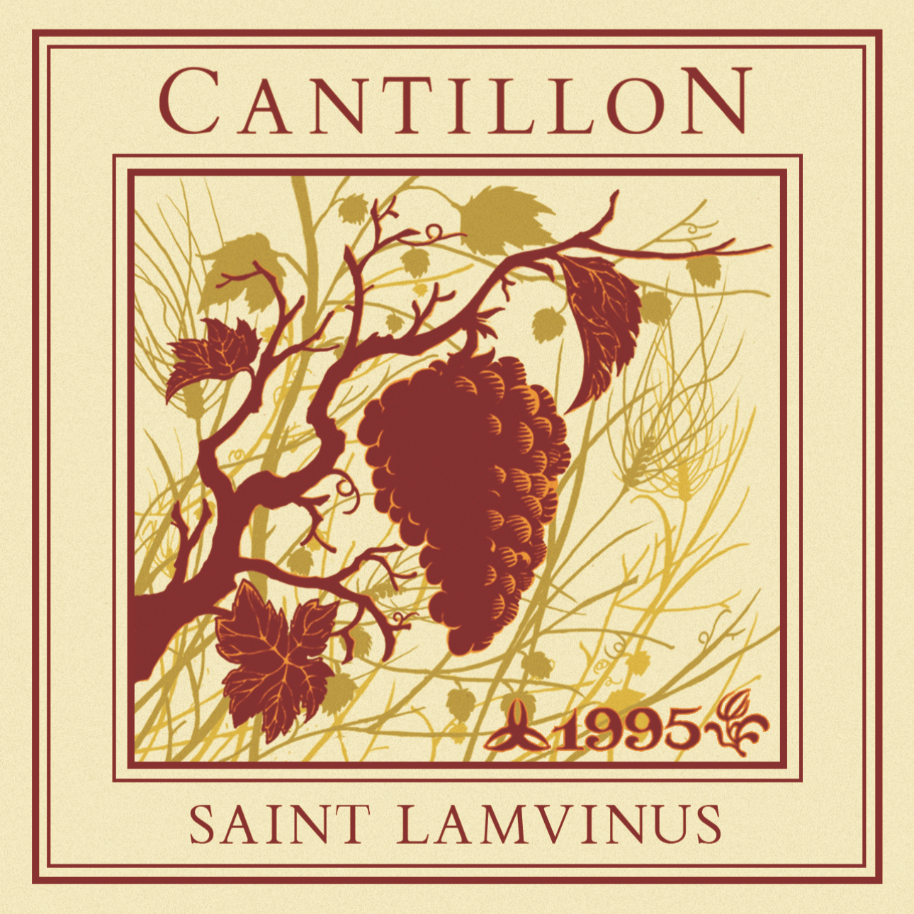
By the mid-2010s Jean Van Roy, of Brussels’ Brasserie Cantillon, found himself in a similar dilemma to Bacelle. He had inherited control of the brewery from his father Jean-Pierre, and with it a range of beers adorned with artwork commissioned in the 1980s and 1990s from artist friends of his father, some of which received criticism either for their outdated look or their perceived sexist overtones. Van Roy the younger wanted to bring some novelty and modernity to the brewery. He already had a candidate in mind, and wasn’t long contacting de la Senne’s Goovaerts to design a series of new labels for a couple of upcoming bottle releases. Even as he loved Goovaerts’ designs for Magic Lambic, La Vie Est Belge and others, Van Roy wasn’t completely satisfied. “I’m a big fan of Jean’s work, but there was one issue,” he says. “It’s so closely linked to De La Senne’s brand. [And] that’s why I was looking for someone else.” A mutual friend from AMMO’s Magasin 4 circle, familiar with his artwork for the venue, suggested to Van Roy AMMO might be able to help with his designer problem.
Shared Philosophies
But before working with the brewery, AMMO first had to understand what they did. Cantillon’s spontaneously-fermented, tart, and complex - even confrontational - lambic beers were still a mystery to the illustrator, attached as he remained to his Trappists, his De Rankes and his de la Sennes. One Wednesday morning before he was due to teach his art class, AMMO dropped into Cantillon’s tasting room in Anderlecht for a chat and a beer with Van Roy. He left several hours later slightly tipsy but with a deeper appreciation for Van Roy’s work. “We have the same philosophy in our work,” Van Roy says, “[Commitment to] a job well done, which may take time, but which will satisfy the customer.” AMMO doesn’t disagree. “I think we speak the same language. We appreciate the old school ways,” he says. The pair’s first collaboration was a design for Cantillon’s 2017 Zwanze beer celebration in honour of Van Roy’s second son Sylvain. The design is identifiably AMMO, Syvlain sitting on the Iron Throne from Game of Thrones, flanked by lambic barrels. Vigneronne, a grape lambic, was next alongside redesigning labels for Cantillon’s ad hoc collaborations with winemakers - including Drogone Lambic, Divin Lambic, Vin Santo, Chenin Blanc, and others.
Van Roy has also let him loose on some of Cantillon’s more regular beers, such as the port barrel-aged Brabantiae. For these assignments, as at De Ranke, AMMO is always cautious in working with, not against, the brewery’s grain, making sure his aesthetic is put at the service of promoting what for the brewery’s are cherished heirlooms, and not the other way around. “I learned this with music. It was always really important with me to find [out] what kind of emotion you want to translate with your music,” AMMO says. “With beers, I proceed in the same way. What I do with de Ranke is really different from No Science, which is really different from Cantillon….[In each collaboration] we really worked together to find our own approach, our own identity.” In recent months AMMO has been working on what might be his most daunting assignment from Van Roy: designing a new label for the brewery’s flagship, and most widely-available, beer - Cantillon Gueuze.
Van Roy, Bacelle, and the breweries that have followed in their wake in the last decade are representative of a new wave of brewers who have emerged in the decade since AMMO arrived in Brussels that recognise the importance of the visual identity of their brewery. With good reason; as the number of breweries in Brussels and the rest of the country has grown, competition for the attention of drinkers has become fiercer, and the old ways that discounted the value of marketing are no longer sufficient. Each new brewery opening in Brussels needs to know what its niche is, and needs a recognisable identity that projects this to drinkers. It helps, in Brussels at least, that this new generation of breweries are being opened by art school graduates and graphic designers who understand good design.
Having spent much of his beer design career working with established breweries, AMMO’s latest project has him working on a brewery’s identity from day one. Joel Galy met AMMO at Magasin 4 in the early 2010s when Galy was a volunteer and regular concert-goer. The pair drank together at Moeder Lambic in St Gillis, and it was Galy - then a brewer at Brasserie de la Senne - who put AMMO in contact with Jean Van Roy at Cantillon. In the autumn of 2019, Galy was set to leave de la Senne to work on his own brewery project. Before he did, he brewed a valedictory beer, a Teutonic wheat beer called Weisse. Galy convinced de la Senne to invite AMMO to design the beer’s label in collaboration with their in-house designer and the man who - almost two decades after his first beer label - remains the godfather of Brussels beer artwork, Jean Goovaerts. The result was an illustration combining Goovaerts’ signature bright colours and sharp lines with AMMO’s intricate, engraving-like style.
In 2020 Galy announced his plan to open Brussels’ newest brewery, now called Brasserie de la Mule and to be housed in a converted tramshed in Schaarbeek. Anyone familiar with AMMO would have immediately recognised his handiwork in the design of the brewery’s donkey mascot, for example. and designs centred around AMMO’s typically dense pencil work, the pair look to have carved themselves out an identifiable visual niche in an increasingly crowded Brussels beer scene. Together, these two metalheads have fashioned brewery visuals that nod to AMMO’s influences while also touching, the illustrator says, on iconography from Gold Rush-era America and the Old West. Galy has commissioned from his friend a floor-to-ceiling mural for the brewery’s new taproom, and the brewer’s decision to package his beers in cans means AMMO is working on an unfamiliar canvas. “Cans are amazing, because they give me so much more space to draw,” AMMO says.
Brasserie de la Mule are gearing up for their first proper brew day, AMMO’s work for Cantillon and De Ranke continues alongside his designs for the music industry, and he’s even working on the design of a beer-themed board game called The AMMO. This blow-in from French wine country who just wanted to draw and didn’t know much about beer or Belgium probably never thought he would end up working at the cutting edge of a creative new wave of illustrators and designers redefining the look of Belgian beer. But in the cross-over between Brussels’ music and beer scenes, AMMO has found a collective of like-minded, hard-headed souls who value creative expression. Brewers like Maxime Dumay, Jean Van Roy, and Joel Galy who are unlikely to ever tell their illustrator friend what’s on the bottle doesn’t matter.


