A History of Brussels Beer in 50 Objects // #35 Sketches for a Zinnebir Label

Object #35 - Sketches for a Zinnebir Label
21st century
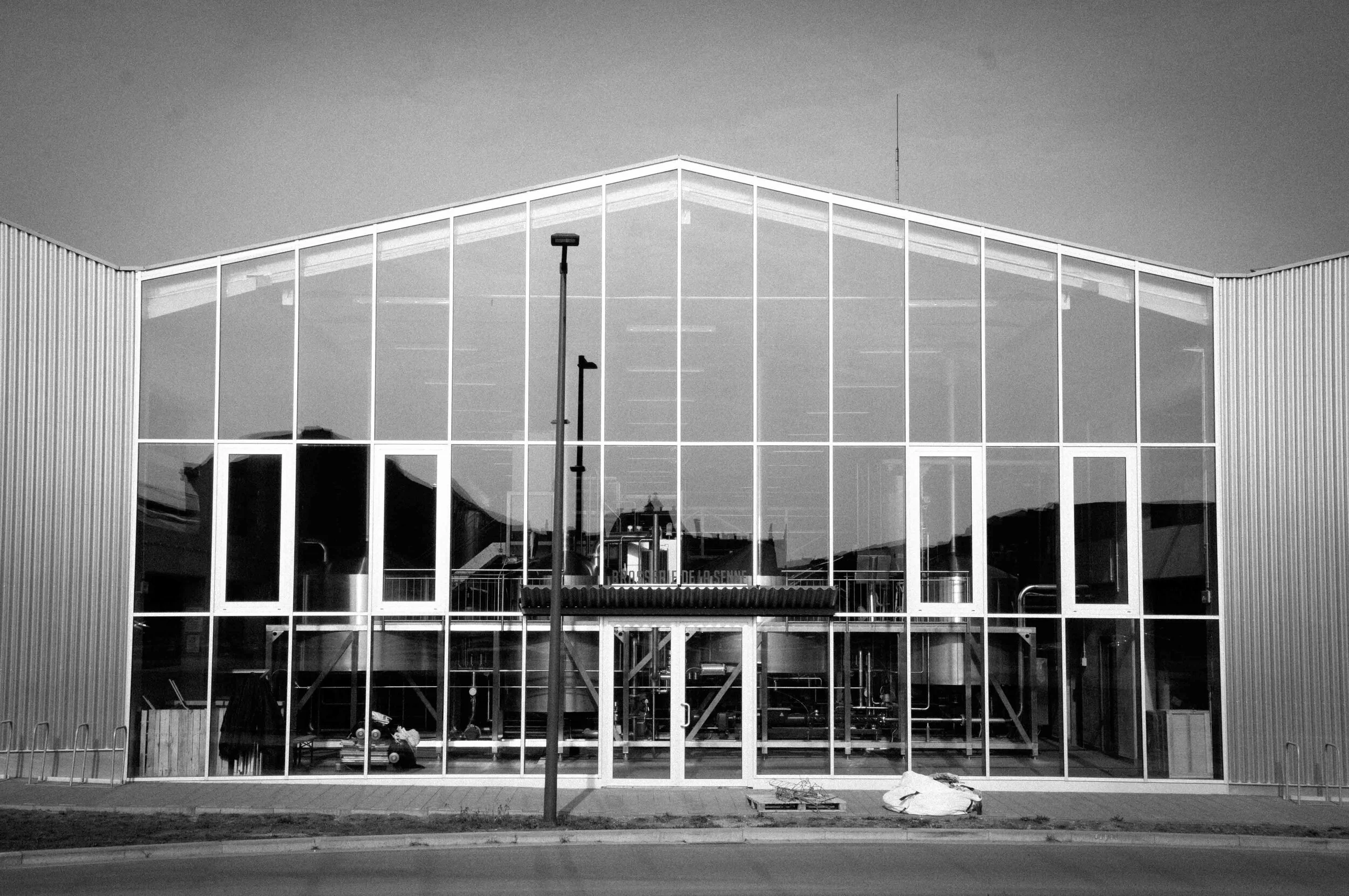
Brewery Life
Find out more about Brussels Beer City’s new weekly series, “A History Of Brussels Beer In 50 Objects” here.
Bernard Leboucq was no illustrator. Given his job at Brasserie de la Senne was primarily brewing beer, that wasn’t much of an issue.
Brasserie de la Senne’s origin story is a well-trodden tale. In early 2002 Leboucq was homebrewing in the basement of a squat, providing a beer called Zinnebir for the second edition of the Zinneke Parade - a biennial festival celebrating Brussels’ diverse neighbourhoods and multicultural population. It was on the margins of the festival that a fateful meet-cute occurred between Leboucq and Yvan De Baets, a fellow Brussellaar and a youth-focused social worker with a keen interest in brewing and beer history.
Within a year Leboucq had started a brewery - the Sint-Pietersbrouwerij - in a Flemish suburb just outside Brussels, an earlier plan of his to open a brewery in Ixelles having failed to materialise. De Baets became Leboucq’s de facto technical consultant until in 2006, when together they launched Brasserie de la Senne. Brewing by necessity in various locations around Belgium, the pair maintained their connection with their home city, always harbouring the wish to return and featuring Brussels iconography heavily in their new brewery’s identity.
Hand-drawn in ink on brown craft paper by Leboucq, the earliest Zinnebir labels featured a muddy illustration of the Zenne river, and “Zinnebir” in big bold lettering. Zinnebir itself was more refined, taking inspiration from the early-20th century Belgian Pale Ale (or Spéciale Belge) tradition, but diverging from this amber, malty template in favour of something, according to De Baets, “drier, hoppier and more bitter”. Their Zinnebir was also a reaction to the dark, sweet, heavy beers dominating mainstream Belgian brewing in the early 2000s. Instead, it channelled de la Senne’s twin influences of English cask ales that married complexity with drinkability and Mitteleuropa’s noble hop tradition.
It was a successful formula. This assertively bitter (for Belgium) beer and its stablemates filtered out of Brussels, eventually making it to an American beer importer who expressed an interest in Zinnebir, on one condition: new, more attractive labels.
Fortunately for Leboucq, help was close at hand. His cousin, Jean Goovaerts, happened to be a trained artist and comics illustrator. Leboucq was soon on the phone to him. “[Bernard] said, ‘I’m in a mess, you need to help me!”,’ Goovaerts recalls. After a few hours doodling and what Goovaerts calls “automatic creation”, they came up with a new design inspired in part by art deco and Goovaerts’ love of Russian suprematism and the modernist aesthetic of interwar political posters.
The Zenne was retained, but transformed from black into a bright green stream winding its way between cubist buildings towards lettering proclaiming “Zinnebir: A Brussels People’s Ale” and a golden-yellow stylised sunrise. It was an optimistic image, foreshadowing the coming rebirth of brewing in Brussels and an optimistic future de la Senne was about to embark on - even if the brewery was to spend the rest of the decade in nomadic exile from Brussels, biding their time for the chance to return to their spiritual home.